Apple Doesn't Use a Capsule for the Battery Icon Cap
从 Apple 官方 Sketch 设计文件出发,拆解电池图标的每一个像素级细节
I’ve been pixel-peeping Apple’s official Sketch design files for a while. Most things look “right” at normal zoom. But when you go deep — 1:1 pixel reconstruction in SwiftUI — the details get weird. Good weird.
The battery icon is a perfect example.
The Cap Is Not What You Think
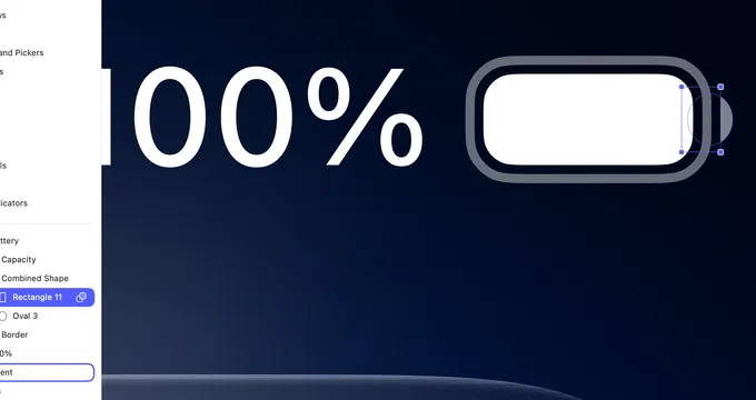
The small nub on the right side of the battery icon — the cap — looks like a simple rounded rectangle. Or maybe a semicircle. At glance, sure.
Open the Sketch file. Zoom in. Select the layer.
It’s a Combined Shape made of two separate primitives:
- Rectangle 11:
4.28 × 7.16pt — not square, not even close - Oval 3:
4.94 × 5.65pt — not a circle either
Both shapes are non-regular. The rectangle is taller than it is wide. The oval is wider than it is tall. They’re combined with a Union boolean operation — merged into a single shape.
The result is a cap that’s subtly off from anything a standard API gives you. It’s not Capsule(). It’s not Circle(). It’s a bespoke form that Apple measured and decided on.
No integer values. No “close enough.”
Reconstructing It in SwiftUI
When I rebuilt this 1:1 in SwiftUI, I couldn’t use Capsule or RoundedRectangle. I had to reach for mask:
Circle()
    .frame(width: 4.94 * scale, height: 5.65 * scale)
    .mask(
        Rectangle()
            .frame(width: 4.28 * scale, height: 7.16 * scale)
            .offset(x: 3 * scale)
    )
    .foregroundStyle(.black.opacity(0.4))
    .offset(x: -1.5 * scale)
The approach is different from the Sketch boolean, but the result is the same:
- Sketch: ellipse + rectangle → Union → combined path
- SwiftUI: ellipse → masked by a rectangle offset to the right → only the right half of the ellipse is visible
Same shape. Different construction. And neither of them uses anything “standard.”
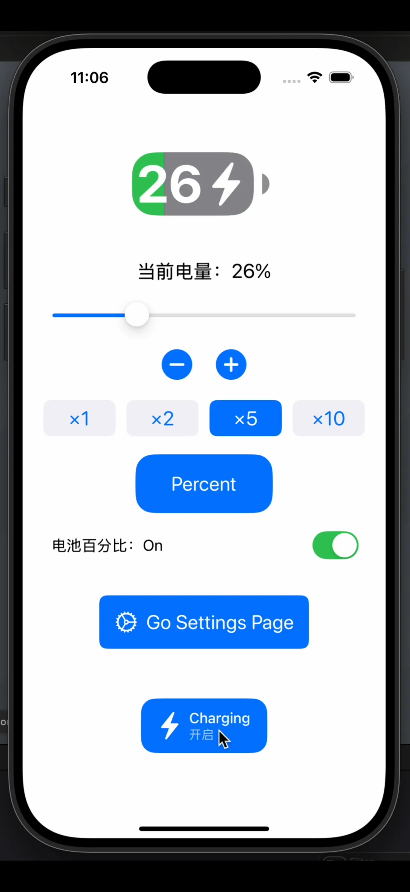
The Percentage Mode Problem
There’s one more thing worth noting. In percentage mode (when the battery shows a number), the design spec has the fill color extend beyond 50% — it visually overflows the container boundary.
This is intentional. Apple wanted the percentage label to sit inside a fully colored background, so the fill rectangle covers the entire icon, and an empty-area overlay is applied from the right side to represent the remaining capacity. The “empty” side comes in from the right:
GeometryReader { geometry in
    let emptyWidth = geometry.size.width * (1 - batteryLevel)
    Rectangle()
        .fill(.gray)
        .frame(width: emptyWidth)
        .offset(x: geometry.size.width - emptyWidth)
}
.clipShape(RoundedRectangle(cornerRadius: 5 * scale))
The fill doesn’t grow from left to right. The empty space shrinks from right to left. Clipped to the rounded rect shape. This avoids color-boundary flickering as the level changes, and it’s why the design spec shows the fill “overflowing” — it’s a visual encoding choice baked into the implementation strategy.
Why Does Any of This Matter?
Because the battery icon is maybe 25×13 points. It’s tiny. Nobody sees these details consciously.
But Apple cared enough to:
- Use a non-standard boolean shape instead of a built-in primitive
- Specify parameters to two decimal places
- Design the fill animation strategy around visual stability rather than literal representation
That’s the standard. And it shows up in a 25pt icon that most people never consciously look at.
Rebuilt from Apple’s official Sketch design resources. SwiftUI implementation by @ieuforu.